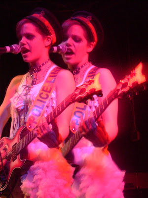
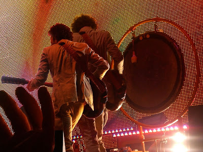
THIS PROGRAM IS INCREDIBLY FRUSTRATING. ...But I'm gradually getting a feel for it, and realizing all the cool crap you can do with it. In my first attempt at photoshoppin', I used two pictures that I took at a concert (unhealth-ily obsessed with the Lips, I know.) and combined them to create two Wayne Coynes. I'm not sure if this was our exact assignment, but I'm really just trying to get comfy with this program. I found the quick selection tool helpful... And the soft-edge eraser kind-of became my best friend.
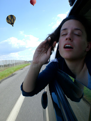
 Second attempt: a picture I took combined with image taken from paintedhorizons.com. ...Kinda obvious, but I sort-of enjoy the surreal feeling of it. I tried to play with the color levels and bright/contrast of the balloons to mesh better with the picture.
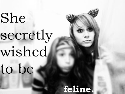
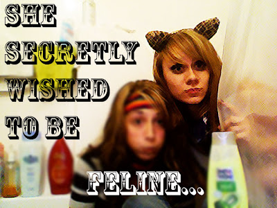
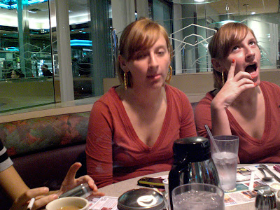
Same idea as the Wayne one. Two Julies... which would actually be terrifying, if you knew this girl. =)
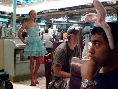
Um, these are my friends Oscar and Pairs? (zimbio.com) Very, very obvious, but I laugh anyway.
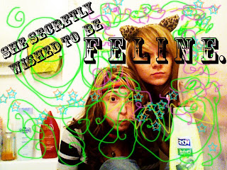
Lastly, two Hayleys. I think this might be my worst, probably due to sleep deprivation. I blame 2-D?
